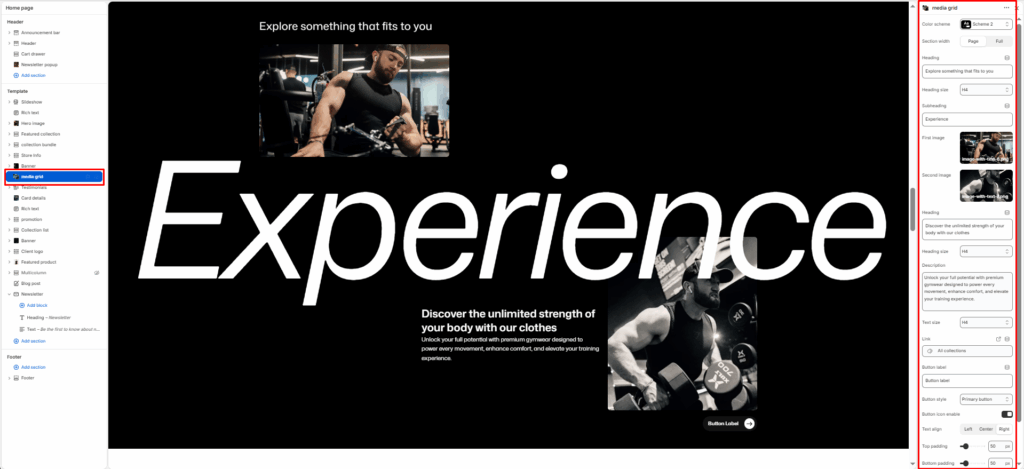
The Media Grid is a high-end storytelling section. It features two primary images, two smaller supporting text.
Color scheme
Select your preferred color palette for the background and text.
Section Width
- Page: Constrains the content to the theme’s maximum site width.
- Full: Stretches the section to the edges of the browser window.
First image
The image on the left side.
Second image
The image on the right side.
Heading
Enter the main text for the section. This field supports multi-line text to create a bold statement.
Subheading
Enter the big and animation text for the section.
Heading Size
Choose from H1 (largest) to H6 (smallest) to manage visual hierarchy.
Description
Add a secondary paragraph of text below the heading.
Text Size
Controls the font size of the description text.
Button Label
Enter text (e.g., “Shop Now”) to display a call-to-action button.
Button Link
Paste a URL or select a page/product from the Shopify store.
Button Style
Choose between available button styles. The styles depend on your theme’s design system.
- Button icon
- Primary button
- Secondary button
- Full button
- Link button
- Button with icon
Text Align
Set the alignment of the text and button to left, center, or right.
Top/Bottom Padding
Adjust the vertical spacing (in pixels) to give the section room to breathe.


