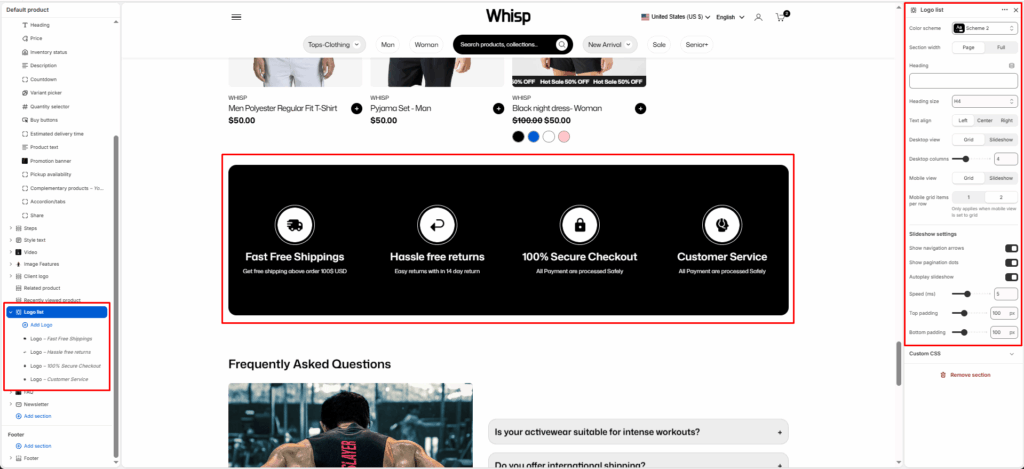
The Logo List section allows you to showcase brand features, partner logos, or certifications in a grid or slider layout.
Section Settings
Color scheme
Select your preferred color palette for the background and text.
Section Width
- Full: Stretches the section to the edges of the browser window.
- Page: Constrains the content to the theme’s maximum site width.
Heading
Add a main title for the section (for example: “Our Features”, “Our Partners”, or “Brand Certifications”).
Heading size
Choose the heading tag (H1-H6) to control the visual prominence and SEO hierarchy.
Text align
Align the heading and logo items to the Left, Center, or Right.
Desktop view
Choose how the logos appear on desktop. Options: Grid or Slider.
Desktop columns
Select the number of logos displayed per row when in Grid mode (commonly 3-6).
Mobile view
Choose how the section appears on mobile devices–Grid or Slider.
Mobile grid items per row
Set how many logos appear per row on mobile when using Grid view (usually 1 or 2).
Enable desktop slider
Enable or disable the slider functionality on the desktop view.
Slider speed (ms)
Define the transition speed between slides (in milliseconds).
Show navigation
Display arrow controls for easy manual navigation.
Show pagination
Display small dots below the slider to indicate the current slide.
Top padding / Bottom padding
Adjust vertical spacing above and below the section for consistent layout spacing.
Blocks Setting
Each Logo block represents one image item — a brand logo, product badge, or feature icon.
Logo image
Displays a single logo or image within the grid or slider layout.
Logo background
Choose a background color or style behind the logo. Useful for icons that need contrast or circular backgrounds.
Heading
Add a heading for the icon.


