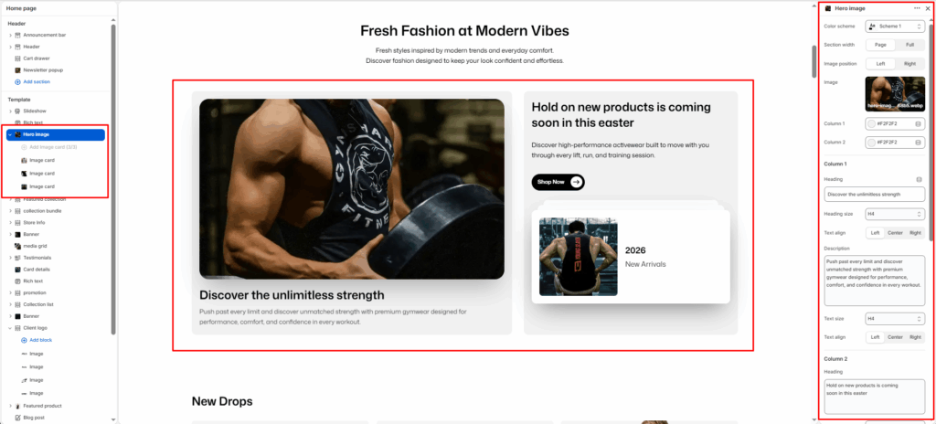
The Hero Image is designed to create a bold, two-column layout combining a large product image on one side with promotional content, description, and call-to-action buttons on the other.
Section Settings
Color scheme
Select your preferred color palette for the background and text.
Section Width
- Full: Stretches the section to the edges of the browser window.
- Page: Constrains the content to the theme’s maximum site width.
Image position
Set the position of the main hero image:
- Left: Displays the image on the left side.
- Right: Displays the image on the right side.
Image
Upload the main hero image to be displayed prominently in the section.
Column 1
Heading
Add a bold heading for the left column. E.g., Discover the unlimitless strength.
Heading size
Select the size of the heading (e.g., H1, H2, H3, H4, H5, H6).
Text align
Set the alignment of the heading text (e.g., Left, Center, Right).
Description
Add descriptive text to support the left column heading. E.g., Push past every limit and discover unmatched strength with premium gymwear designed for performance, comfort, and confidence in every workout.
Text size
Control the size of the description text (e.g., H1, H2, H3, H4, H5, H6).
Text align
Set the alignment of the description text (e.g., Left, Center, Right).
Column 2
Heading
Add a heading for the right column. E.g., Hold on new products is coming soon in this easter.
Heading size
Select the size of the heading (e.g., H1, H2, H3, H4, H5, H6).
Description
Add descriptive text to support the right column heading. E.g., Discover high-performance activewear built to move with you through every lift, run, and training session.
Text size
Control the size of the description text (e.g., H1, H2, H3, H4, H5, H6).
Link
Enter a URL or search for a page to link the right column content.
Button label
Enter the call-to-action text for the button. E.g., Shop Now.
Button style
Select the visual style of the button (e.g., Primary button, Secondary button).
Button icon enable
Toggle to show or hide the icon displayed on the button.
Text align
Set the alignment of the right column text (e.g., Left, Center, Right).
Button link
Enter a URL or search for a page as the button’s destination link.
Button style
Select the visual style of the button link (e.g., Primary button, Secondary button).
Top padding / Bottom padding
Adjust vertical spacing above and below the section for consistent layout spacing.
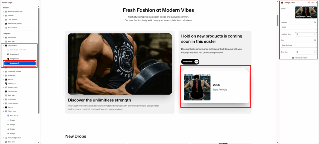
Blocks (Image Card)
Each Image Card block displays a small card with an image, heading, and label text within the right column area.
Image
Upload an image to display inside the card.
Heading
Enter the heading text for the card. E.g., 2026.
Heading size
Select the size of the card heading (e.g., H1, H2, H3, H4, H5, H6).
Text
Enter a short label or subtitle below the heading. E.g., New Arrivals.
Text size
Control the size of the card label text (e.g., H1, H2, H3, H4, H5, H6).


