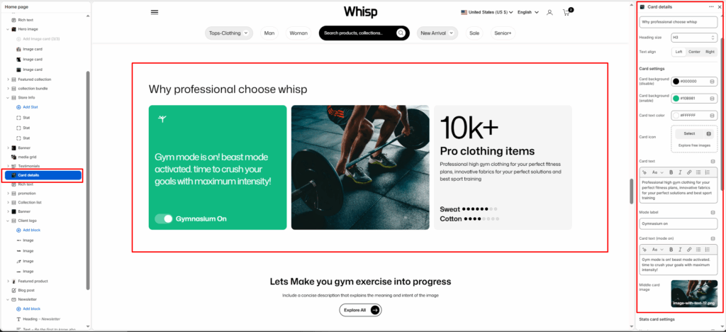
The Card details is designed to showcase key brand highlights and product statistics in a visually rich three-card layout.
Section Settings
Color scheme
Choose the color scheme that matches your site design. This affects text and button colors over the section.
Section width
Choose how wide the section appears on the page:
- Page–keeps the video within the page content width.
- Full–expands the video to full browser width.
Heading
Add a main heading for the section.
Heading size
Select a heading size from theme-defined options such as h1, h2, h3, h4, h5, and h6.
Card Settings
Card background (disable)
Set the background color of the card when the toggle is in the off/disabled state.
Card background (enable)
Set the background color of the card when the toggle is in the on/enabled state.
Card text color
Set the text color displayed on the card.
Card icon
Select an icon to display at the top of the card. You can also explore free images to use as the card icon.
Card text
Add the main descriptive text displayed on the card in its default state. E.g., Professional high gym clothing for your perfect fitness plans, innovative fabrics for your perfect solutions and best sport training.
Mode label
Enter the label text shown next to the toggle switch. E.g., Gymnasium On.
Card text (mode on)
Add the text to display on the card when the toggle is switched to the on state. E.g., Gym mode is on! beast mode activated. time to crush your goals with maximum intensity!
Middle card image
Upload an image to display in the center card of the layout.
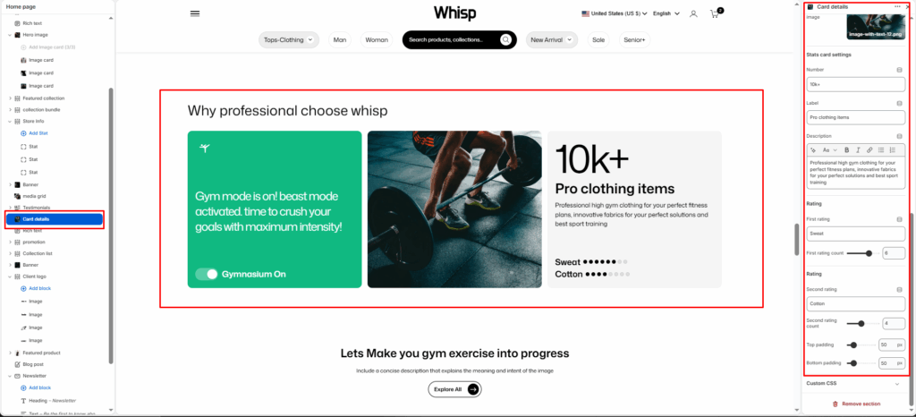
Stats Card Settings
Image
Upload an image to display at the top of the stats card.
Number
Enter the key statistic or number to display prominently on the stats card. E.g., 10k+.
Label
Enter a short label describing the statistic. E.g., Pro clothing items.
Description
Add a supporting description for the statistic. E.g., Professional high gym clothing for your perfect fitness plans, innovative fabrics for your perfect solutions and best sport training.
First rating
Enter the label for the first rating bar. E.g., Sweat.
First rating count
Set the value of the first rating bar using a slider (out of 10).
Second rating
Enter the label for the second rating bar. E.g., Cotton.
Second rating count
Set the value of the second rating bar using a slider (out of 10).
Top Padding / Bottom Padding
Adjusts vertical spacing above and below the section.
Block Settings
Each Timeline Item block represents a single milestone or moment in the brand’s history.
Year
Enter the year for this milestone. E.g., 2009, 2010, 2018.
Image
Upload a visual representation for that specific step.
Heading
The name of the step.
Description
The main paragraph or supporting text under the heading.


