The Main Product section displays detailed product information on the product page.
It includes images, a title, a price, a description, variants, a quantity selector, buy buttons, and more.
This section is designed to provide customers with all the necessary product details and actions in a clean, organized layout. It is the core of the product page template and integrates seamlessly with Shopify’s product data.
Section Settings
Color Scheme
Selects the visual color theme for the product section. Based on theme presets (e.g., Scheme 1, Scheme 2, etc.)
Section Width
Determines whether the section spans the full page width or fits within the content container.
- Page–Content width constrained
- Full–Full-width layout
Gallery Layout
Controls how product images are displayed in the gallery.
- Grid
- Grid one
- Thumbnails at the bottom
- Thumbnails left
- Slider
Enable Gallery Background
Adds a background behind the product image gallery area for better contrast.
Enable Sticky Content on Desktop
Keeps product information (title, price, buy buttons, etc.) fixed while scrolling on desktop screens.
Top Padding
Adds spacing above the product section.
Bottom Padding
Adds spacing below the product section.
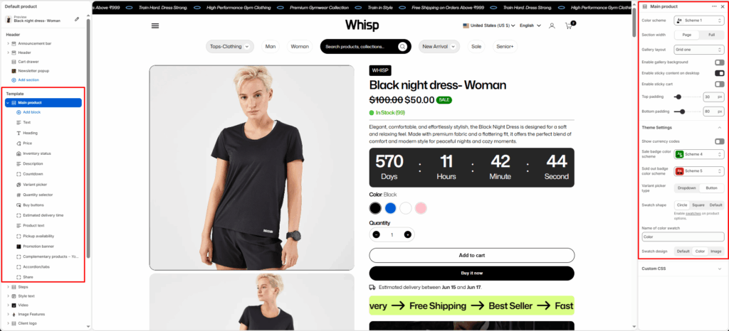
Default Content Blocks
Each Main Product section includes editable blocks that represent different product details and interactive elements.
These can be rearranged or toggled on/off in the theme editor.
Text
Displays a short text or subheading above the product title (e.g., product tagline or label).
Title
Shows the product title dynamically from Shopify product data.
Description
Displays the product’s full or short description.
Price
Shows the product’s price, including sale and compare-at prices.
Variant Picker
Allows customers to choose product variants (e.g., size, color, type).
Inventory Status
Displays stock availability (e.g., “In Stock”, “Only 2 left”).
Quantity Selector
Enables customers to select quantity before adding to cart.
Buy Buttons
Adds Add to Cart and Buy It Now buttons.
Complementary Products
Suggests matching or related products using Shopify’s “You may also like” feature.
- Limit–Controls how many complementary products are shown.
- Heading–Add a custom heading above the complementary product block.
Block Settings
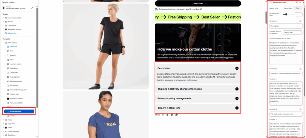
Layout Type
Choose how the content is displayed.
- Accordion: Displays items stacked vertically, expandable one at a time.
- Tabs: Displays items side by side in horizontal tab navigation.
Default Open Item
Select which item should be open by default when the page loads. 0 to 4.
Content Fields
You can define up to four headings and their associated content.
Heading
Enter a title for the first accordion/tab item.
Content Source
Choose where the content for the first item comes from:
- Product description — Automatically pulls the main Shopify product description.
- Custom content — Lets you manually enter custom text, HTML, or metafield content below.
Custom Content
Add your own content (rich text or HTML) if the content source is set to Custom content.
Icon with Text
The Icon with Text block lets merchants display small, visual highlights about the product — such as shipping info, return policy, sustainability badges, or product guarantees.
It helps build customer trust and communicates key selling points directly under the product information area.
This block supports multiple icon-text pairs, with the option to arrange them horizontally (side-by-side) or vertically (stacked).
Layout Type
- Horizontal: Displays icons and text side by side in a single row.
- Vertical: Displays icons and text stacked vertically, ideal for narrow layouts or mobile-first designs.
Icon and Text Items
Each icon-text pair includes two editable fields:
Icon
Upload an image icon (e.g., PNG, SVG, or JPG) representing the feature.
Recommended size: 64×64 px or similar square ratio.
Transparent PNG or monochrome SVG icons work best for visual consistency.
Text
Enter a short, descriptive label for the icon.
Pickup Availability
Displays local pickup information for customers near physical store locations.
Share
Displays share buttons for customers to share the product link via social platforms.
Accordion/Tabs Block
The Accordion/Tabs block is used on the Product (Default product) template to organize detailed product information into collapsible accordions or tabbed content. This improves readability and allows customers to quickly find relevant information.
Accordion
- Content is stacked vertically
- Only one item can be expanded at a time (optional)
- Ideal for mobile and long-form content
Tabs
- Content is displayed in horizontal tabs
- Users can switch between sections without scrolling
- Ideal for desktop layouts
Product Text Block
The Product Text block allows merchants to display multiple promotional labels or product highlights below the product information area.
Block Settings
Color Scheme
Select the color scheme used for the product text block.
First Text
Enter the first promotional message. – Example: Fast and secure delivery
Second Tag
Enter the second promotional message.
Third Tag
Enter the third promotional message.
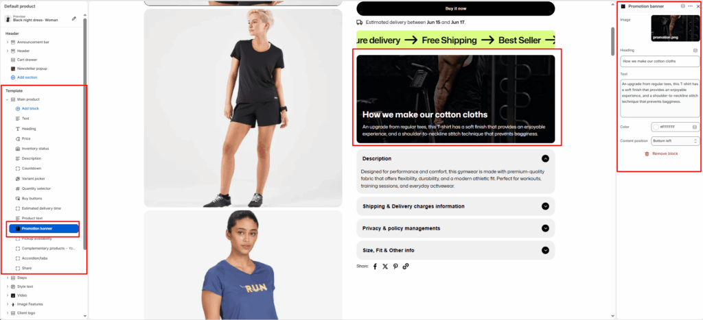
Promotion Banner Block
The Promotion Banner block allows merchants to display a promotional image with overlay content directly within the product information area.
Block Settings
Image
Upload an image to display as the promotion banner.
Heading
Enter the main banner heading.
Text
Add supporting content or promotional information displayed over the banner image.
Text Color
Select the color used for the banner heading and description.
Content Position
Choose where the content appears on the image.
- Top Left
- Top Center
- Top Right
- Center Left
- Center
- Center Right
- Bottom Left
- Bottom Center
- Bottom Right
Estimated Delivery Time Block
The Estimated Delivery Time block displays an expected delivery range directly on the product page. It helps set clear customer expectations and improves purchase confidence.
Estimated Delivery Time block
- Placement near inventory & variants
- Dynamic date calculation logic
- Message customization with placeholders
- Processing days & shipping range settings
- Weekend handling and pre-order visibility
- UX and conversion benefits


