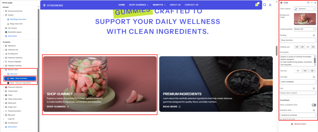
The Banner Cards section displays a grid of full-image promotional cards, each with a heading, description, and link. It’s ideal for showcasing collections, campaigns, or featured content in a bold, visual layout.
Section settings
Color scheme
Choose the color scheme that matches your site design. This affects text and button colors over the section.
Section width
Choose how wide the section appears on the page:
- Page–keeps the video within the page content width.
- Full–expands the video to full browser width.
Top padding / Bottom padding
Adjusts vertical spacing above and below the section.
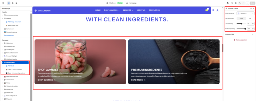
Block: (Card)
Add individual banner cards to the grid. Each card displays a full background image with overlaid content.
Color scheme
Select a color scheme for the individual card.
Background image
Upload an image to use as the full background of the card.
Content position
Choose where the heading, description, and link appear on the card — Bottom Left, Bottom Right, Top Left, or Top Right.
Heading
Enter a heading for the card (e.g., SHOP GUMMIES).
Heading size
Select the size of the card heading — H2, H3, H4, or H5.
Description
Enter a short supporting text displayed below the heading.
Text size
Select the size of the description text — H4, H5, or H6.
Link label
Enter the text for the card’s link button (e.g., SHOP GUMMIES, READ MORE).
Countdown
Show countdown timer
Select the Show countdown timer checkbox to show or hide a live countdown timer on the card.
Expiration date
Enter the target date and time for the countdown timer (e.g., 2026/12/31 23:59:59). The timer counts down days, hours, minutes, and seconds until this date.