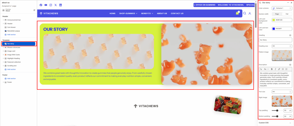
The Our Story section allows you to present multiple “stories” or features in a unique zigzag layout. This is ideal for showcasing room inspirations, historical timelines, or key design philosophies.
Section settings
Color scheme
Select a predefined color palette to match your theme’s aesthetic.
Section width
- Full: Stretches the section to the edges of the browser window.
- Page: Constrains the content to the theme’s maximum site width.
Left card background color
Choose the background color for the content panel on the left side.
Left card text color
Select the text color used within the left content panel.
Heading
Enter the main title for the section (for example: Our Story).
Heading size
Choose the heading size (H1–H6) to control the visual hierarchy.
Pattern image
Upload a decorative background or pattern image displayed behind the heading and description on the left side.
Description
Add the main content describing your brand story, company mission, or business values.
Text size
Choose the size of the description text (H1–H6).
Right image
Upload the primary image displayed on the right side of the section. This can be a lifestyle image, product photo, or brand-related visual.
Top padding / Bottom padding
Adjust vertical spacing above and below the section for consistent layout spacing.