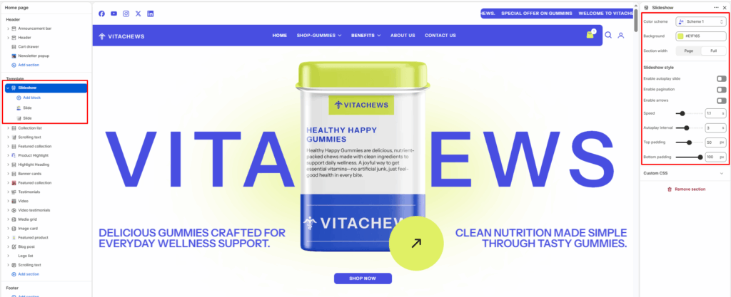
The Slideshow section displays large visual slides with images, text overlays, and call-to-action buttons. It is commonly used as a hero section on the homepage to highlight promotions or collections.
Color scheme
Controls the color palette used for text, buttons, and overlays inside the slideshow.
Circle background color
Select a color to use as the background of the circular button displayed on each slide. This color is applied with slight transparency to blend naturally with the slide image.
Section width
Control how wide the banner appears:
- Page: Keeps the banner within the page container width.
- Full: Spans edge-to-edge across the browser window for a full-width.
Slideshow style
Manages the behavior and interaction of the slides, including autoplay, navigation, and animation speed.
Enable autoplay slide
Automatically transitions between slides without user interaction.
Enable pagination
Displays pagination indicators (dots) to show the current slide position.
Enable arrows
Shows navigation arrows to manually switch between slides.
Slideshow speed
Controls the animation speed when transitioning from one slide to another.
Autoplay interval
Sets the delay time between automatic slide transitions.
Top padding / Bottom padding
Add vertical spacing above and below the banner content for better layout balance.
Slide content (Group block)
Each slide can contain a Group block that holds headings, text, and buttons, allowing structured and flexible content layout.