The Product Feature section displays a product image alongside key product information in a two-column layout. It’s ideal for highlighting a specific product’s benefits, ingredients, or key details with a clean, side-by-side design.
Section settings
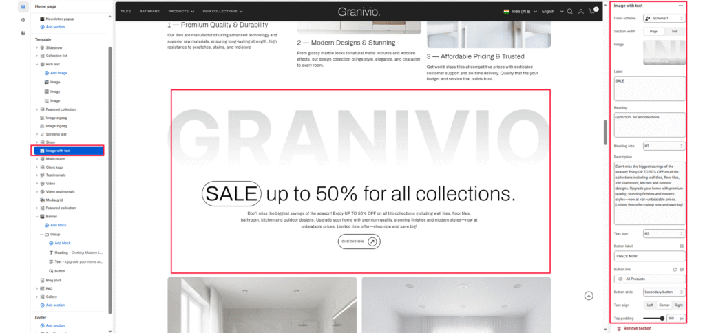
Color scheme
Choose a predefined color palette to match the section with your store’s theme style.
Section width
- Page: Constrains the content to the theme’s maximum site width.
- Full: Stretches the section to the edges of the browser window.
Image position
Choose whether the product image appears on the Right or Left side of the content.
Heading
Enter the main heading for the section.
Heading size
Adjust the scale of the heading from H1 to H6 to establish visual hierarchy.
Description
Enter a detailed paragraph to provide more context about the promotion or offer.
Text size
Control the font size of the description paragraph for better readability.
Button label
Input the text for the action button (e.g., “CHECK NOW”).
Product image
Upload an image to display on the image side of the section.
Top/Bottom Padding
Adjust the vertical spacing (in pixels) to give the section room to breathe.
Blocks: (Info column)
Add up to multiple info columns displayed as a grid below the description. Each block shows a labeled list of values — ideal for ingredients, benefits, or per-gummy details.
Label
Enter a label for the info column.
Color
Select the color of the label text.
Values (One per line)
Enter the list of values for this column, one per line (e.g., Pectin, Natural Flavors, Fruit Extracts). Each line appears as a separate item below the label.


