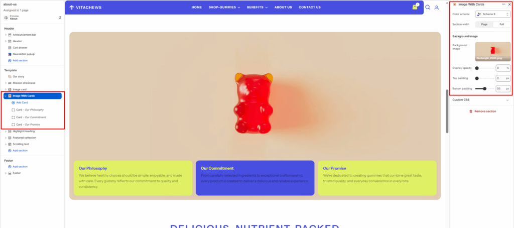
The Image With Cards section combines a large background image with multiple customizable content cards displayed along the bottom. It is ideal for highlighting company values, key features, services, or product benefits in a clean and engaging layout.
Color scheme
Select your preferred color palette for the background and text.
Section width
- Page: Constrains the content to the theme’s maximum site width.
- Full: Stretches the section to the edges of the browser window.
Background image
Upload the main background image displayed behind the content cards. This image serves as the visual focus of the section.
Overlay opacity
Adjust the darkness of the overlay placed on top of the background image to improve text visibility. Set it to 0% for no overlay or increase it for stronger contrast.
Top/Bottom Padding
Adjust the vertical spacing (in pixels) to give the section room to breathe.
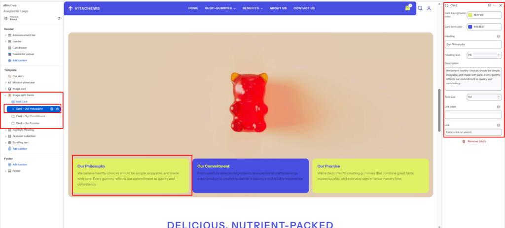
Blocks (Card)
Each content card is added as an individual block and can be fully customized.
Card background color
Choose the background color for the individual card.
Card text color
Select the text color displayed inside the card.
Heading
Enter the card title, such as Our Philosophy, Our Commitment, or Our Promise.
Heading size
Select the heading size from the available typography options.
Description
Add the main content or explanation displayed inside the card.
Text size
Choose the size of the description text.
Link label
Optionally add a button or text link label (for example, Learn More or Read More).
Link
Select the page, collection, product, or external URL that the link should open when clicked.