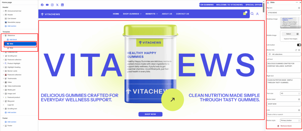
The Slide block is used within the Slideshow section to create individual slides. Each slide can include its own image, text, buttons, and layout options. It’s ideal for showcasing promotions, collections, or brand stories in a visually engaging carousel.
Block settings
Big text / Brand text
Upload or select an image for desktop devices. This image defines the main visual background of your slide.
Desktop image
Enter a large background text that displays behind the slide content as a decorative element (e.g., VITACHEWS).
Mobile image
Optional. Upload a separate image optimized for mobile screens. If left empty, the desktop image will be used on all devices.
Left text
Enter text to display on the bottom left area of the slide.
Right text
Enter text to display on the bottom right area of the slide.
Text size
Select the size of the left and right text — H1, H2, H3, H4, H5, or H6.
Show circle button
Select the Show circle button checkbox to show or hide a circular arrow button overlaid on the slide image.
Circle button link
Enter the URL for the circular button to navigate to when clicked.
Button label
Enter the text to display on the main call-to-action button (e.g., SHOP NOW).
Button link
Enter the URL the main button should navigate to when clicked.
Button style
Select the visual style of the button — Primary or Secondary.